Girls Who Code
A playful way
into coding.
An academic rebranding concept exploring how a visual identity could make coding feel more welcoming to young learners.
A friendly robot, a confident purple palette and a vocabulary of coding symbols bring curiosity and personality to the identity. The concept connects brand graphics, digital interface elements and learning materials through one visual language.
Created during my master’s studies. An independent academic proposal, not commissioned by or affiliated with Girls Who Code.
Curiosity starts
with an invitation.
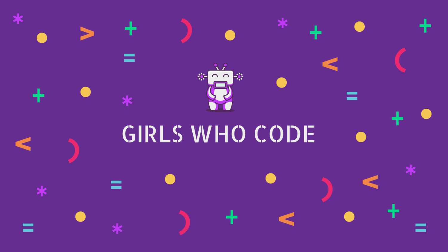
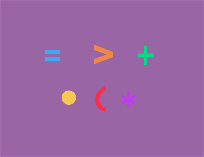
The design direction approaches coding as something to explore. A smiling robot gives the subject a friendly character, while familiar marks become a colourful set of building blocks.

One bold base.
Room to play.
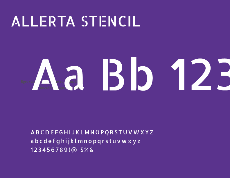
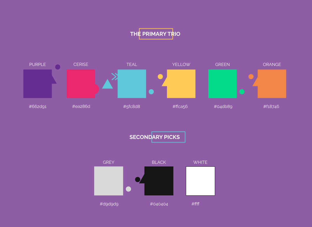
Purple anchors the identity. Bright accents bring energy to the symbols and supporting graphics. Allerta Stencil gives the wordmark a technical rhythm, balanced by the mascot’s rounded shapes.
The same character,
on screen.
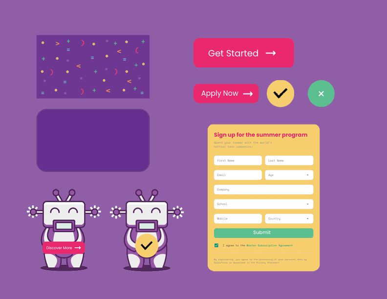
The interface study carries the palette and graphic elements into buttons, form fields and supporting messages. Rounded controls give practical interactions the same approachable tone as the wider identity.
A visual component exploration within the academic project, rather than a developed or user-tested product.
From the screen
to the school bag.
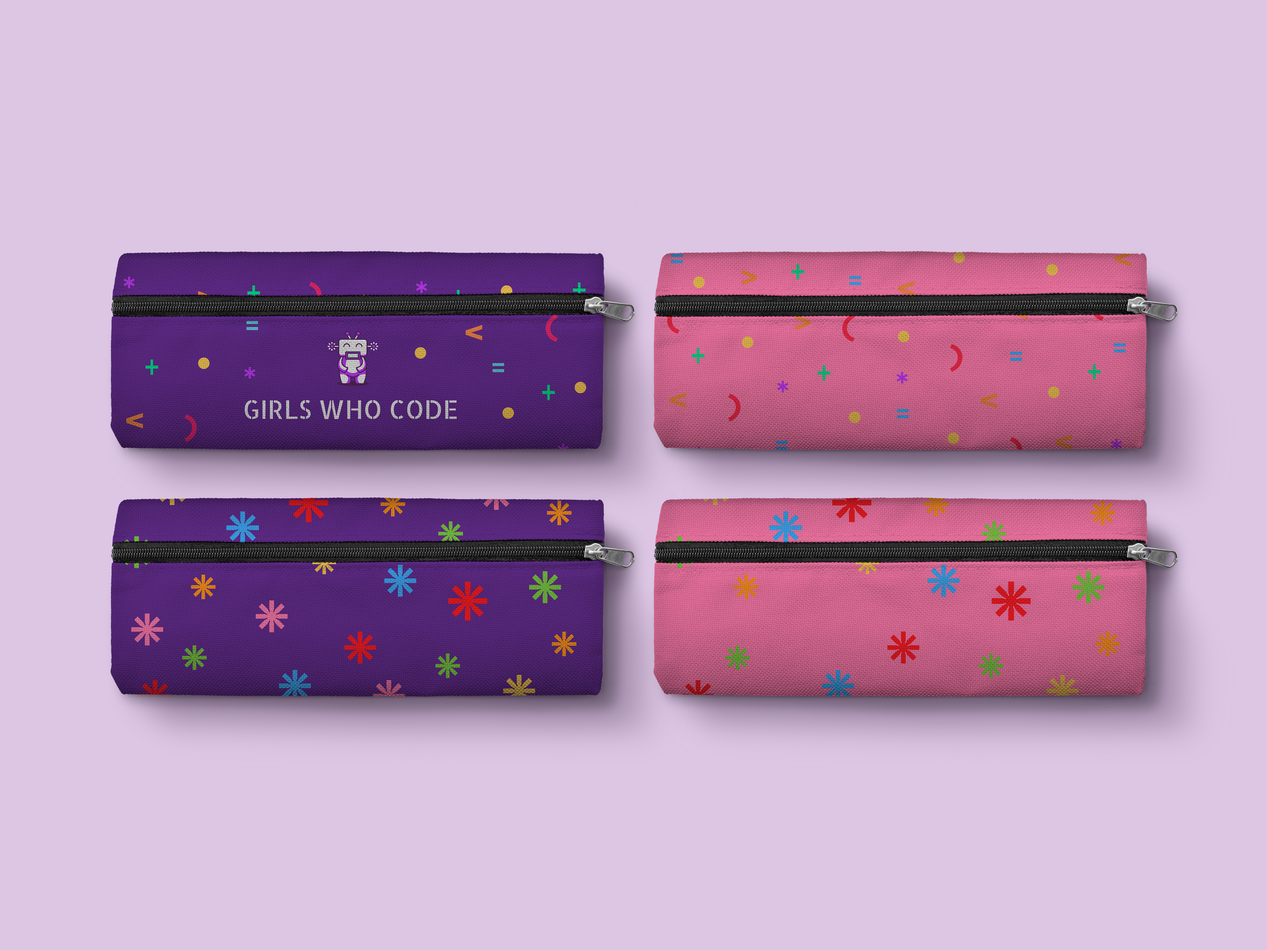
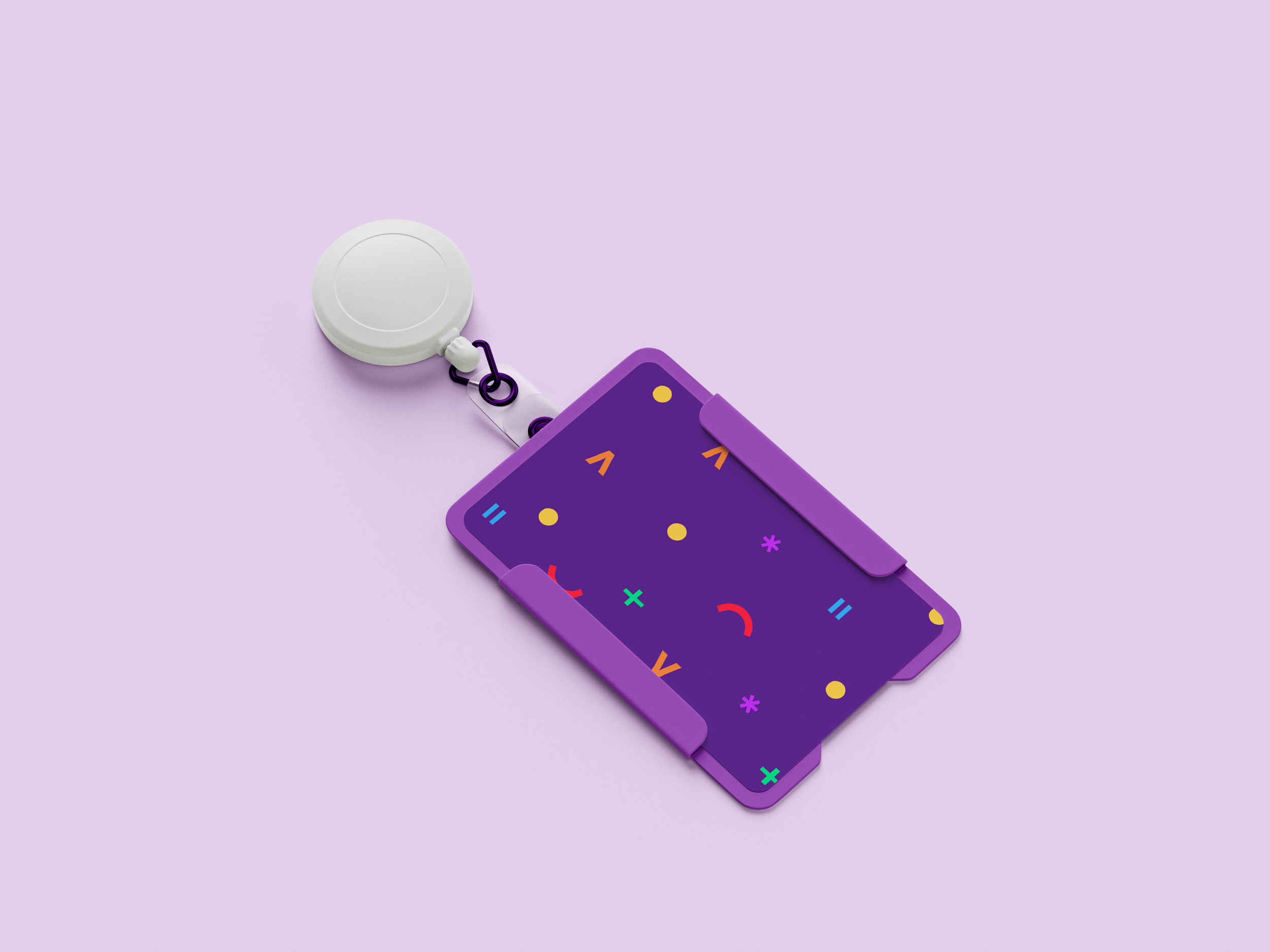
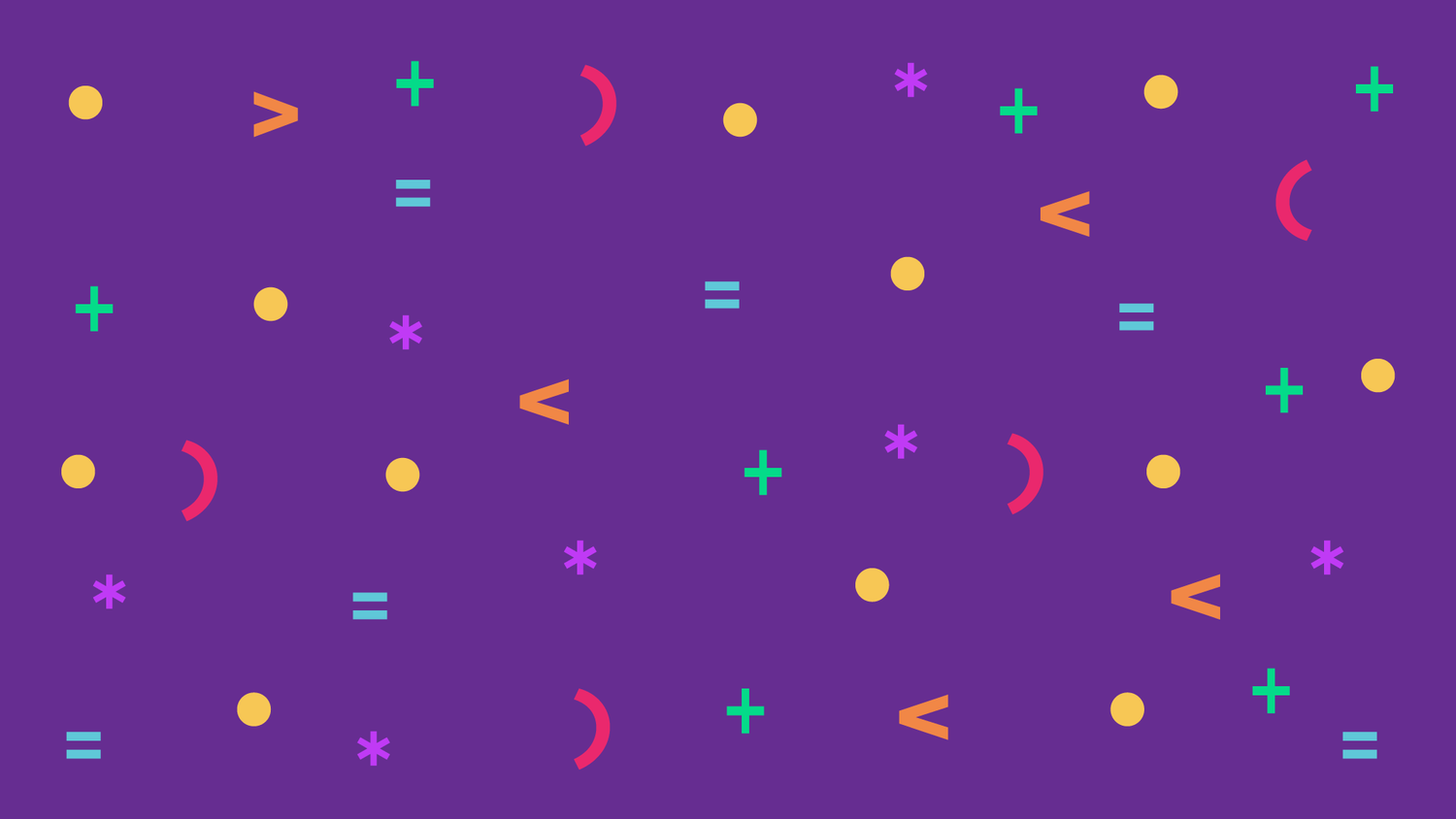
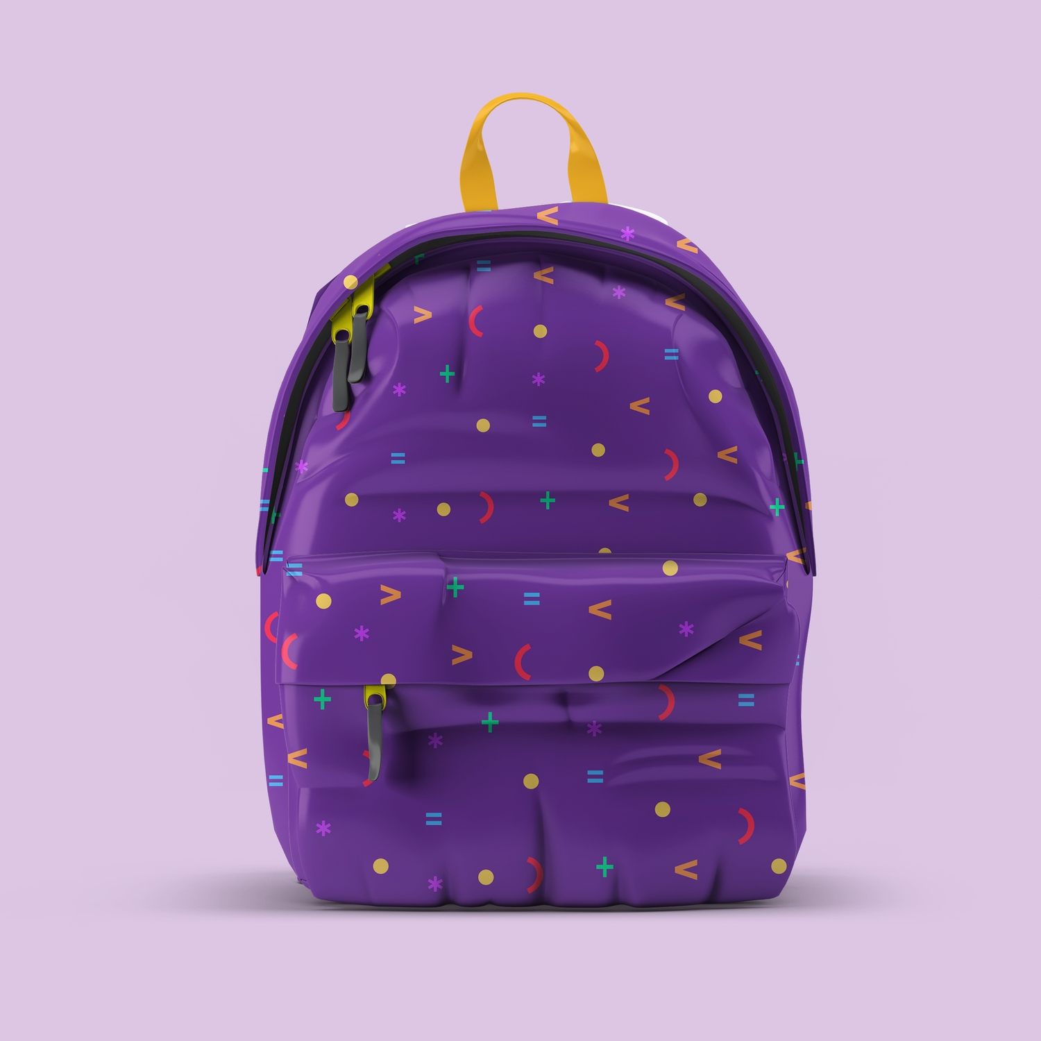
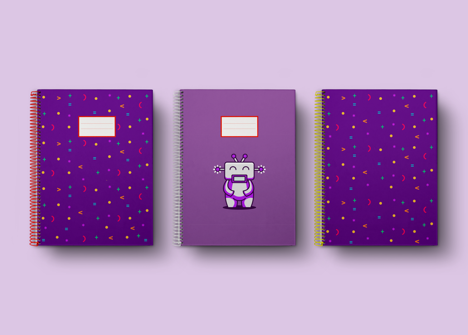
The pattern extends the identity into objects associated with learning. A backpack and notebook show how the same symbols can connect different formats without relying on the full logo every time.
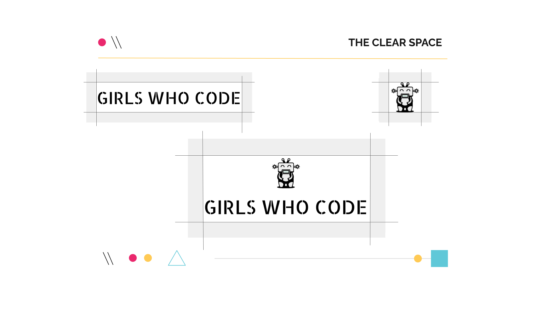
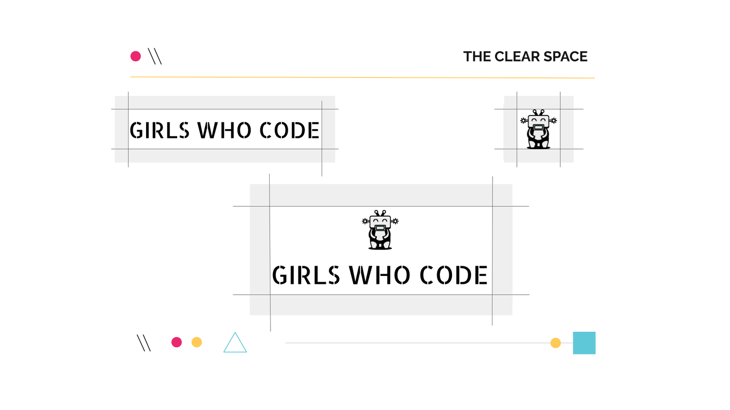
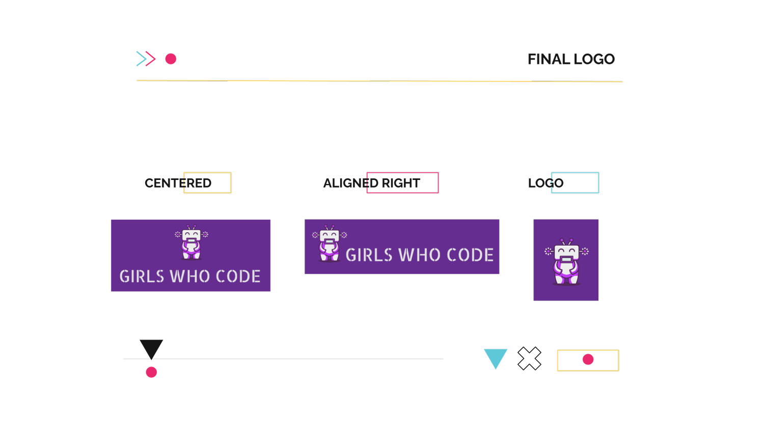
View logo variants & spacing studies ↗
A technical subject.
A human invitation.
The project explores how illustration, colour and a flexible graphic system can give coding education an approachable visual expression.
Academic branding concept by Greyci Svendsen. All applications shown are conceptual mockups.
Girls Who Code
Visual identity · Art direction · Illustration
Academic concept · Created during my master’s studies
Making coding feel welcoming, creative, and accessible.
Girls Who Code is a nonprofit working to close the gender gap in technology. For this academic project, I developed a rebranding concept exploring how visual identity and messaging could make coding education more appealing to young girls.
The aim was to create an approachable identity that encourages curiosity, confidence, and a sense of belonging in technology.